• This is a reminder of 3 IMPORTANT RULES:

    1- External self-promotion websites or apps are NOT allowed here, like Discord/Twitter/Patreon/etc.

    2- Do NOT post in other languages. English-only.

    3- Crack/Warez/Piracy talk is NOT allowed.

    Breaking any of the above rules will result in your messages being deleted and you will be banned upon repetition.

    Please, stop by this thread SoccerGaming Forum Rules And Guidelines and make sure you read and understand our policies.

    Thank you!

New Kits 2007/2008

easyeasyeasy

Senior Squad
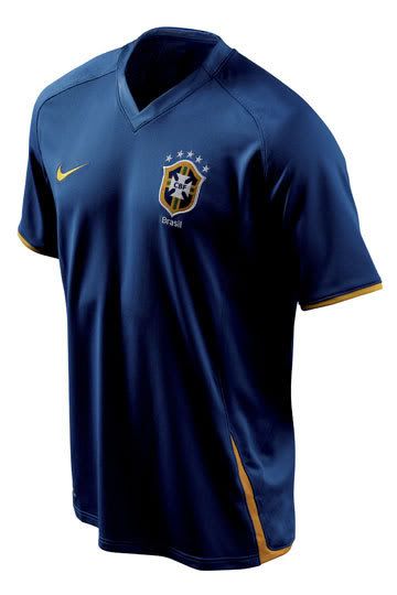
I know FIFA have a daft directive in the World Cup where one team wears a light coloured jersey and the other a dark jersey just incase anyone's watching the game on a black and white telly (it's 2007 not 1967 FFS FIFA!), but it's not a rule.

Romania, for example, have a yellow home kit and a white away kit.
 

$teauA

Superstar
simon202020;2458735 said:
Brazil Away 08...


close up badge:


umm a little late there buddy (jimorrizon)
 

CimBom

Youth Team
Italy home is nice, the puma logos on the shoulders suck.

There should be just one logo, not 3. Like in the Premier League.
 

adobe_sun

Youth Team
The Italy shirt looks rather like some handball team's kit. It just ain't right to have some much yellow in it, with all those loggos... It just begs for one "CANAL +" or "RAI 1" written in the middle and i will sware, it is a kit of some mid table team from italian 3rd division...

As for the french away shirt - it's pretty cool, this reddish adidas. I like it when some changes are applied to the away shirts. It just gets boring otherwise.
 

kramer11

Youth Team
The retro look can either go well and be stunningly simple, or it can be like that Italy one and go wrong, looking neither retro, nor modern, but some hideous thing in between.
 

adobe_sun

Youth Team
Successful retro looks hgad the Germany shirt on Euro 96 and the french one on WC 98. Both teams went on to grab the title, btw.
But like kramer said, doing retro style either goes well, or it fails massively :D
 

SafHossain03

Youth Team
While I agree the number of Puma badges are ridiculous, I dont really think that picture does it justice. From that picture it looks like a bland shade of blue against vanilla yellow. We should reserve judgement for when they hit shop displays. Oh and I also deteste the Puma templates, are all home kits going to have this template now?

Just imagine the new Brasil away shirt with and Italy badge on it. I'd buy that.
 

abyPREDATOR

Senior Squad
Come on guys , that's not the new Italy home kit . Does that look like this year PUMA design to you ??? I don't believe that PUMA would do such stupid kits for theyr most important team , for the world champions ...FORZZA SQUADRA AZZURA !!!


you see , they are simply wondering to ...
 

CimBom

Youth Team
I think the "yellow" is gold.

Puma used for Italy always a special design, not the normal templates like Poland, Czech Republic, etc. had.

But this time all the Puma teams have the same two templates.
Switzerland home and Italy home is the same.

A few days ago I saw the Switzerland home in a store: the 3 puma badges are plastic, feels like a rubber. :(
 

Interista13

Starting XI
Naw, I think there's a good chance of that Italy kit to be real.

The thing that makes it look hideous are those 'bright yellow' trims. I really hope they are darker in real life...more like a nice 'dark' gold...

I kind of like this shirt...I don't LOVE it but one could get used to it...I remember when I saw the new Italia Badge at the WC...geez...I hated that one so much...but now I find it alright...

(Still, the old Italia badge was the best: The Scudetto!)


Top