-
This is a reminder of 3 IMPORTANT RULES:
1- External self-promotion websites or apps are NOT allowed here, like Discord/Twitter/Patreon/etc.
2- Do NOT post in other languages. English-only.
3- Crack/Warez/Piracy talk is NOT allowed.
Breaking any of the above rules will result in your messages being deleted and you will be banned upon repetition.
Please, stop by this thread SoccerGaming Forum Rules And Guidelines and make sure you read and understand our policies.
Thank you!
You are using an out of date browser. It may not display this or other websites correctly.
You should upgrade or use an alternative browser.
You should upgrade or use an alternative browser.
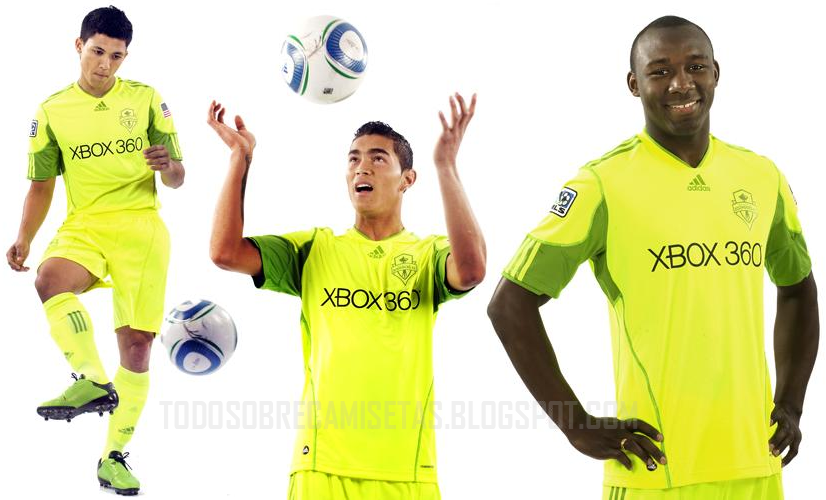
New Kits 2010/2011
- Thread starter FI.Matthijs
- Start date
kp40;2852468 said:Chelsea kit is good expect those red lines, what the hell is that?
Its a tribute or a homage to the Pensioners.(our old nickname, or old Chelsea if yer like)
The red colour was in the club badge during the early 1950s.
We also had red socks for the first time during 1960s and had red in other parts of our kits until the late 80s.
Xifio;2852862 said:you would think, right? like how the white trim at the end of the England Away long sleeve looks better than the short sleeve ...
but instead, adidas completely ditched the subtle red trim on the long sleeve:

That's too bad, they should've kept the red trim at the end of the longsleeves.
Either way though, I am of the opinion that longsleeves always look better than short sleeves.
Call me crazy but I think Chelsea should wear blue socks with red trim with these kits.
cfdemarco;2853224 said:but I think Chelsea should wear blue socks with red trim with these kits.
Agree with yer. The hem of our shorts do have a bit of red if I'm not mistaken.
EDIT: yup, even mentioned above.

Italiano137
Club Supporter
Maybe someone can help me out here with the new Italy jersey. At subside sports they have a couple players you can select to get on the jersey.
The thing is, both Di Natale and Gilardino have both number 11. In the Fifa 10 Di Natale's number is 16.
I don't want to order an Di Natale Italy jersey with the num 11 then find out it's switched. I also don't want to wait till the last minute and have a hard time ordering a jersey. Forgot to add. By any chance were jersey numbers confirmed somewhere that EA switched Di Natale to 16?
Thanks.
Xifio;2853266 said:haha, well most people would say that your opinion stems from your support of Man Yoo... but do I agree, there should be more red trim, even on the socks ... and Chelsea did used to have red trim, even on the socks ... I say I agree not just from an aesthetics standpoint: if this really is a tribute to the pensioners, then I think a bit of red on the neck, with some thin lines at the bottom of the shorts and only on the end of short sleeves, being claimed as a tribute seems more of a gimmick than a genuine attempt at a tribute ... and even if the whole exercise is just a timely gimmick masked as something more significant to sell more shirts (this is not news), they should do a better job of incorporating the colour red more significantly (but not overwhelmingly) into the design of the tribute shirt ...
I don't think it's necessarily due to me liking United...it just strikes me as looking good because it's something different.
About the socks...I am a big fan of having the socks be the same color as the shorts. For example, United almost always wear red shirts/white shorts/black socks at home...but sometimes they will wear white socks at home and I think it looks a lot better than the black socks. But at the same time, I like it when they wear red shirts/black shorts/black socks on the road.
So I just think it would be cool for a season if Chelsea wore blue socks at home, with some red trim at the top.
But I really do like those shirts...I might even buy a Drogba one. Or if Chelsea buy David Villa this summer I will buy one for sure.
Xifio;2853266 said:haha, well most people would say that your opinion stems from your support of Man Yoo
Shirt's are being designed not only for the club and players but also to sell as well. Of course in some ways it can be viewed as a gimmick, but nevertheless gimmick or not, if some of our senior fans(who followed The Pensioners) appreciate it then it's more than fulfilled its purpose as a tribute,on top of that it does look very very nice in my opinion.
")
I'm tempted to buy one, haven't bought a Chelsea kit since the 06/07 season, couldn't be bothered before but this new kit sure would be a nice addition to the collection.
King of the Kop
Club Supporter
Nady;2852328 said:Has the Pool away been posted here? Here it is anyway:

Its not the away kit. Its the Home Goalie shirt.

Jaboldinho
Fan Favourite
Love it! ")
")