-
This is a reminder of 3 IMPORTANT RULES:
1- External self-promotion websites or apps are NOT allowed here, like Discord/Twitter/Patreon/etc.
2- Do NOT post in other languages. English-only.
3- Crack/Warez/Piracy talk is NOT allowed.
Breaking any of the above rules will result in your messages being deleted and you will be banned upon repetition.
Please, stop by this thread SoccerGaming Forum Rules And Guidelines and make sure you read and understand our policies.
Thank you!
You are using an out of date browser. It may not display this or other websites correctly.
You should upgrade or use an alternative browser.
You should upgrade or use an alternative browser.
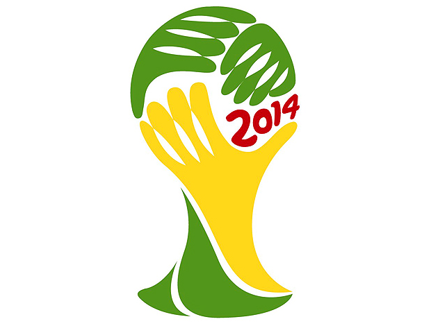
Logo WC Brazil 2014
- Thread starter H0US3
- Start date
The second looks pretty cool, the first one looks way too simple.
D
Dipanjan
Guest
The Macaw one looks pretty good. Which insane guy chose the first one over the second one? 

^ Not any of this ?


^ Not any of this ?

jani;2880685 said:The first logo looks like someone doing a facepalm.
dude, do you receive the message? 5 fingers? 5 times?
but, the second logo is tooooo much betteeeeeer
Arnau
NGR LVR
H0US3;2881567 said:dude, do you receive the message? 5 fingers? 5 times?
Wich mean you won't succes in South Africa.
Sevillista
Starting XI
The second logo may look better, but I think it's too similar to this year's logo. Not in the details of course, but in the colors and general shape.


At least the selected logo doesn't look like Lisa giving Bart a blowie.


At least the selected logo doesn't look like Lisa giving Bart a blowie.


foxmulderx
Youth Team
Sevillista;2882026 said:The second logo may look better, but I think it's too similar to this year's logo. Not in the details of course, but in the colors and general shape.


At least the selected logo doesn't look like Lisa giving Bart a blowie.


You are rigth. The shape of the parrot like the country shape is the same concept as the actual WC 2010 logo, i mean it would be a repetition of the same concept for a new cup. But i still think the first logo is so empty and got no heart.

MelvinSmiley
Reserve Team
First one symbolizes the rainforest? Wonder how much of it will be left in 2014....look it up on google earth, its frightening....gigantic brown fishbone patterns....


